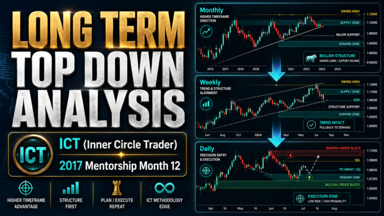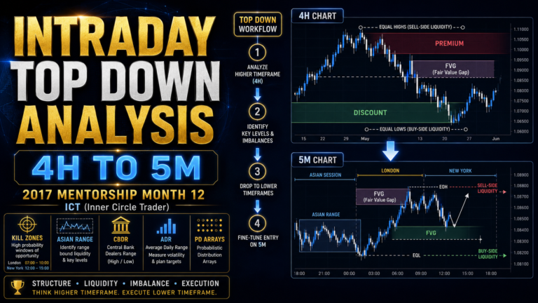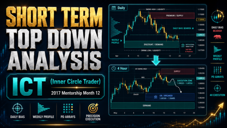
Intermediate Term Top Down Analysis is a structured method of converting higher-timeframe market information into a practical weekly bias and then carrying that bias down to the daily chart.
The concept was taught by Michael J. Huddleston, the founder of ICT (Inner Circle Trader), in the 2017 ICT Private Mentorship Core Content Month 12. It explains how traders can organize relative strength, Commitment of Traders data, market sentiment, intermarket relationships, institutional order flow, market structure and PD Arrays into one repeatable analytical process.
The purpose is not to apply every ICT concept to every chart. The purpose is to use the correct analytical tool on the correct timeframe and gradually refine the market narrative.
Huddleston explains:
“We take the information we’ve gleaned from the monthly chart and transpose it to the weekly.”
The monthly chart supplies the long-term framework. The weekly chart refines that framework into an intermediate-term directional bias. That information can then be transferred to the daily chart for more precise trade planning.
What Is Intermediate Term Top Down Analysis?
Intermediate Term Top Down Analysis is the weekly-to-daily stage of the broader ICT top-down process.
It begins after the trader has already studied the monthly chart and established the larger market context.
The weekly analysis is used to:
- Determine the impact of the weekly perspective
- Identify higher-timeframe directional bias
- Compare leadership and weakness
- Examine commercial hedging
- Evaluate market sentiment
- Classify the current market profile
- Confirm the idea through intermarket analysis
- Define market structure
- Identify institutional order flow
- Build a weekly PD Array Matrix
- Calibrate important price levels
- Establish a weekly bias
- Transfer that bias to the daily chart
This method helps traders move from general market information to a clear intermediate-term expectation.
Without an organized process, traders may collect many concepts but have no idea how to apply them in the correct order.
Huddleston states:
“Once you understand what it is specifically you’re doing and how you’re breaking the market down, it does not take long.”
The analysis becomes faster with repetition, but it should never become careless.
The Role of the Weekly Chart
The weekly chart acts as a bridge between long-term and short-term analysis.
The monthly chart may show a broad bullish or bearish environment, but it often lacks enough detail to frame a precise intermediate-term trade.
The weekly chart provides greater definition.
It can reveal:
- Weekly order blocks
- Weekly fair value gaps
- Institutional swing points
- More precise premium and discount arrays
- Relative strength differences
- SMT divergence
- Weekly market structure
- Reactions from monthly levels
- Intermediate-term support and resistance
A PD Array that is not visible on the monthly chart may become obvious on the weekly chart.
This is why the trader should not force all analysis onto one timeframe.
Each timeframe has its own function.
The monthly chart establishes the long-term narrative.
The weekly chart develops the intermediate-term bias.
The daily chart later provides shorter-term structure and entry refinement.
The Intermediate Term Top Down Analysis Sequence
ICT organizes the weekly analysis into a logical sequence.
The process begins with information that helps narrow the market selection. It then moves toward technical analysis and price calibration.
The sequence is:
- Relative strength analysis
- Commitment of Traders analysis
- Market sentiment analysis
- Market profiling
- Intermarket analysis
- Market structure
- Institutional order flow
- Weekly PD Array Matrix
- Key price-level calibration
- Weekly directional bias
- Transposition to the daily chart
Each stage supports the next.
The trader does not begin by randomly looking for a fair value gap or order block. The market must first be filtered through broader evidence.
Start With Relative Strength Analysis
The first stage of Intermediate Term Top Down Analysis is relative strength.
If the monthly chart does not provide a sufficiently clear opportunity, relative strength can help identify the markets most likely to produce meaningful movement.
The trader compares related markets and asks:
- Which market refuses to make a lower low?
- Which market refuses to make a higher high?
- Which asset is leading its group?
- Which asset is lagging?
- Which market shows the strongest institutional sponsorship?
- Which market shows the greatest weakness?
A market that fails to make a lower low while related markets decline is demonstrating relative strength.
A market that fails to make a higher high while related markets rally is demonstrating relative weakness.
The objective is to separate leaders from laggards.
Relative Strength in Currencies
When analyzing currencies, the US Dollar Index should be considered.
If the Dollar Index is expected to decline, foreign currencies quoted against the dollar should generally strengthen.
Examples include:
- EUR/USD
- GBP/USD
- AUD/USD
- NZD/USD
The strongest foreign currency will usually:
- Hold a higher low
- Break old highs more easily
- Show stronger bullish displacement
- Respect discount PD Arrays
- Retrace less deeply than related currencies
If the Dollar Index is bullish, foreign currencies should generally weaken.
The trader can then look for the currency that is making the weakest highs or breaking lower most aggressively.
Relative strength helps create a focused watchlist.
Instead of attempting to trade every currency, the trader selects the markets with the clearest leadership or weakness.
Relative Strength in Commodities
The same principle applies to commodities.
A trader may compare related futures markets within a group.
Examples include:
- Grains
- Energy markets
- Metals
- Soft commodities
- Livestock markets
If the broader environment supports higher grain prices, the trader should identify which grain refuses to make a lower low.
That market may be the leadership contract.
A commodity that demonstrates stronger highs, shallower retracements and better support at discount arrays is more attractive than one that remains in consolidation.
Relative strength allows the trader to identify the best representative of the broader market theme.
Relative Strength in Stocks
For stocks, ICT suggests focusing on leadership within strong industry groups.
The trader can identify:
- Strong industry groups
- Strong stocks within those groups
- Stocks holding higher lows
- Stocks breaking resistance
- Stocks receiving institutional sponsorship
The strongest stock in a strong industry group may offer a better opportunity than an isolated stock with no sector support.
The principle remains the same across all asset classes.
The trader wants to trade strength against weakness rather than selecting markets randomly.
Commitment of Traders Analysis
After creating a watchlist through relative strength analysis, the next stage is the Commitment of Traders, commonly called COT.
The COT report provides information about the positions of different groups in the futures market.
ICT focuses heavily on commercial hedgers because their activity often becomes significant near major market highs and lows.
Commercials conduct large-scale hedging activity.
Because of the size of their positions, they may contribute to the formation of important turning points.
The goal is not to follow commercial hedgers on every weekly change.
The goal is to identify when their net holdings reach a meaningful extreme.
Commercial Hedger Extremes
ICT looks for commercial holdings near:
- Six-month extremes
- Twelve-month extremes
- Two-year extremes
- Four-year extremes
A commercial extreme may suggest that the market is approaching a significant high or low.
However, commercial traders and large funds serve different functions.
Commercials are often most useful for identifying the extreme ends of the range.
Large funds may be more accurate during the trending middle portion of the move.
Huddleston explains that traders should seek the “meat in the middle,” where much of the directional expansion occurs.
The practical idea is:
- Commercials can help identify potential tops and bottoms.
- Large funds often participate successfully in the trend between those points.
- The trader attempts to capture the directional expansion after the turning point becomes technically supported.
The ICT COT Hedging Program Concept
A standard COT chart commonly uses a zero line.
Readings above zero are often interpreted as net buying.
Readings below zero are often interpreted as net selling.
ICT proposes a more refined interpretation.
The trader reviews the commercial net position over the previous 12 months.
Then:
- Identify the highest commercial net-holding reading.
- Identify the lowest commercial net-holding reading.
- Measure the range between those two readings.
- Divide that range in half.
- Use the midpoint as a relative dividing line.
- Interpret readings above that adjusted midpoint as stronger buying.
- Interpret readings below it as stronger selling.
This allows the trader to evaluate commercial activity relative to its own recent range rather than relying entirely on the standard zero line.
Commercials may still appear below zero on a conventional chart while showing a meaningful increase in buying relative to the previous year.
This relative interpretation may reveal institutional accumulation that appears modest on a standard COT presentation.
Why COT Data Matters
COT data becomes more useful when it agrees with:
- Seasonal tendencies
- Relative strength
- Higher-timeframe discount or premium
- Market structure
- Institutional order flow
- Market sentiment extremes
A COT reading should not be used in isolation.
For example, commercial buying becomes more meaningful when:
- Price is trading in a weekly discount area.
- The market is approaching a seasonal low.
- Related markets confirm relative strength.
- Retail sentiment is bearish.
- Price begins showing bullish order flow.
The strongest Intermediate Term Top Down Analysis develops through overlapping evidence.
Market Sentiment Analysis
The third stage is market sentiment.
ICT studies sentiment to understand what the broader public and retail trading community believes about the market.
The ideal condition often occurs when retail sentiment is positioned opposite the expected smart-money direction.
The trader wants to identify whether the public is:
- Extremely bullish
- Extremely bearish
- Fearful
- Overconfident
- Convinced that the trend cannot reverse
- Uninterested in a market that is quietly preparing to move
Sentiment is built from several sources.
ICT uses:
- Financial media headlines
- Market commentary
- Retail trading forums
- Public consensus
- Williams %R on the weekly chart
Using Financial Headlines
Financial publications frequently use emotionally charged language near market extremes.
Examples may include:
- Outlook darkens
- Market collapse expected
- Currency faces major trouble
- Historic bull market
- Unstoppable rally
- Worst conditions in years
- No direction ahead
- Major breakout imminent
One isolated headline is not enough.
The trader should look for a pattern of similar stories.
When publications repeatedly promote the same bullish or bearish narrative, public sentiment may become crowded.
The trader then compares that sentiment with institutional evidence.
If commercials are buying, price is in discount and the public is extremely bearish, the market may be preparing to rally.
The key is not to oppose every headline automatically.
The trader should oppose public sentiment only when technical and institutional evidence supports the opposite view.
Retail Forums and Crowd Thinking
Retail forums can provide additional insight into public expectations.
The trader can study discussions surrounding a specific market and identify the dominant opinion.
For example, if most traders are bearish on GBP/USD while:
- The Dollar Index is weakening
- GBP/USD is holding higher lows
- Commercial activity supports buying
- Weekly price is in discount
- Bullish institutional order flow is visible
Then the retail bearish consensus may strengthen the bullish trade narrative.
Retail sentiment is not a standalone entry signal.
It becomes valuable when it is diametrically opposed to the broader institutional framework.
Using Williams %R for Sentiment
ICT also uses Williams %R as a technical sentiment tool on the weekly chart.
The preferred settings discussed are:
- 20-period
- 14-period
- 10-period
The trader does not necessarily apply all three at once.
Instead, the trader reviews previous important highs and lows and determines which setting has historically provided the clearest sentiment readings for the market being studied.
A shorter period such as 10 may respond more quickly but can produce more frequent signals.
A 14-period setting may provide a smoother and more balanced reading.
A 20-period setting offers a longer filter but may react more slowly.
The indicator is used to observe areas where public sentiment may be extremely bullish or bearish.
It should confirm the broader analysis rather than replace it.
Market Profiling on the Weekly Chart
After relative strength, COT and sentiment analysis, the trader examines the market profile.
The weekly chart is classified into one of three broad conditions:
- Consolidation
- Trend
- Retracement
Each profile suggests a different expectation.
Weekly Consolidation
If the market is consolidating, the trader asks:
- Is price preparing to expand?
- Which side of the range is likely to break?
- Are correlated markets already showing direction?
- Is institutional order flow building inside the range?
- Has liquidity accumulated above or below the range?
- Does sentiment support a breakout in the opposite direction?
Consolidation should not automatically be interpreted as indecision.
A market may be accumulating or distributing before expansion.
Intermarket analysis and institutional order flow can help forecast the likely breakout direction.
Weekly Trending Market
If the market is trending, ICT generally favors continuation rather than attempting to pick the exact top or bottom.
In a bullish trend, the trader looks for:
- Retracements into discount
- Bullish order blocks
- Fair value gaps
- Higher lows
- Broken premium arrays
- Continued institutional sponsorship
In a bearish trend, the trader looks for:
- Retracements into premium
- Bearish order blocks
- Fair value gaps
- Lower highs
- Broken discount arrays
- Continued institutional selling
A trending market may eventually reach an extreme, but the first expectation should usually be a retracement rather than an immediate reversal.
Weekly Retracement
If the market is retracing, the trader looks for signs that the original trend will resume.
In a bullish market, a weekly retracement into a bullish monthly or weekly PD Array may prepare the market for another expansion higher.
In a bearish market, a rally into a bearish premium array may prepare the market for another decline.
The weekly retracement is particularly important because it often provides the transition between the long-term monthly narrative and a practical daily trade.
Impulse, Retracement and Expansion
A common weekly profile can be described as:
- Impulse swing
- Retracement
- Expansion swing
The initial impulse reveals directional intent.
The retracement returns price toward institutional value.
The following expansion may extend beyond the size of the original impulse.
This is where higher-timeframe targets and extension objectives become useful.
The trader should recognize that a weekly retracement is not necessarily evidence that the long-term idea has failed.
It may be the exact condition required for an intermediate-term entry.
Intermarket Analysis
The next stage of Intermediate Term Top Down Analysis is intermarket confirmation.
The trader compares the selected market with related assets.
The purpose is to determine whether correlated and inversely correlated markets support the expected direction.
For a bullish market idea, the trader wants positively correlated markets to confirm strength.
Negatively correlated markets should generally show weakness.
For a bearish idea, the opposite should occur.
Positive and Negative Correlation
A positively correlated market tends to move in the same direction.
A negatively correlated market tends to move in the opposite direction.
For example:
- A bullish foreign currency may be supported by a bearish Dollar Index.
- A bearish Dollar Index may support bullish EUR/USD.
- A bullish commodity may be supported by dollar weakness.
- Related equity indices may confirm or reject each other.
- Related currency pairs may display SMT divergence.
Intermarket analysis prevents the trader from studying one chart in isolation.
A market can appear bullish on its own but lack confirmation from the broader environment.
USDX SMT and Correlated-Pair SMT
ICT uses two important forms of weekly SMT analysis.
USDX SMT
A foreign currency pair is compared with the US Dollar Index.
For example, if AUD/USD forms a higher low while the Dollar Index forms a higher high, the lack of confirmation may indicate relative strength in the Australian dollar.
The two markets should normally move inversely.
When they fail to confirm one another, the divergence may reveal institutional positioning.
Correlated-Pair SMT
Two related currency pairs may also be compared.
Examples include:
- EUR/USD and GBP/USD
- AUD/USD and NZD/USD
- Related equity indices
- Related commodity futures
If one market breaks a previous low while the other refuses, the stronger market may offer the better long opportunity.
SMT should be used in the context of higher-timeframe structure and PD Arrays.
Weekly Market Structure
After intermarket confirmation, the trader defines weekly market structure.
Every significant high and low is classified relative to the surrounding price action.
The trader determines whether the current controlling point is:
- Long-term
- Intermediate-term
- Short-term
The relationship among recent highs and lows reveals which swing is currently controlling price.
In a bullish structure, the trader looks for higher highs and higher lows.
In a bearish structure, the trader looks for lower lows and lower highs.
However, ICT market structure is not based only on the visible swing pattern.
The trader also considers:
- SMT divergence
- Institutional order flow
- Broken PD Arrays
- Support and resistance characteristics
- Monthly directional bias
Weekly trades should generally align with both the current market structure and the monthly bias.
Institutional Order Flow
Institutional order flow is one of the most important parts of the weekly analysis.
It helps determine whether larger market participants are supporting higher or lower prices.
In a bullish environment, the trader wants to see:
- Down-close candles supporting price
- Bullish order blocks respected
- Up-close resistance candles broken
- Discount arrays holding
- Premium arrays being traded through
- Strong bullish displacement
In a bearish environment, the trader wants to see:
- Up-close candles resisting price
- Bearish order blocks respected
- Down-close support candles broken
- Premium arrays holding
- Discount arrays failing
- Strong bearish displacement
This provides evidence of institutional sponsorship.
Bullish Institutional Order Flow
Bullish institutional order flow is visible when price consistently respects down-close candles and breaks through up-close candles.
A down-close candle may become a bullish order block after price trades strongly above it.
If price later retraces into that candle and rallies, it demonstrates institutional support.
A bullish market should also move through old highs, bearish order blocks and other premium arrays with relative ease.
The market may temporarily react at those levels, but strong sponsorship should eventually carry price higher.
Bearish Institutional Order Flow
Bearish institutional order flow is the opposite.
Up-close candles should resist price.
Down-close candles that previously supported price should be broken.
Price should move through old lows and bullish discount arrays.
Retracements into premium should create resistance.
The trader uses this information to determine whether the weekly structure is genuinely supported by institutional activity.
Building the Weekly PD Array Matrix
Once the trader selects the relevant weekly price range, it is divided into premium and discount.
The range should be based on meaningful weekly structure.
The trader then identifies the available PD Arrays within that range.
Not every range contains every type of PD Array.
Only the obvious and relevant arrays should be marked.
Weekly Premium Arrays
Potential premium arrays include:
- Bearish order blocks
- Bearish fair value gaps
- Rejection blocks
- Breaker blocks
- Mitigation blocks
- Previous highs
- Buy-side liquidity
- Premium portions of the dealing range
These areas may provide resistance or higher-timeframe objectives.
In a bullish market, premium arrays may act as targets.
In a bearish market, they may provide locations for short entries.
Weekly Discount Arrays
Potential discount arrays include:
- Bullish order blocks
- Bullish fair value gaps
- Rejection blocks
- Breaker blocks
- Mitigation blocks
- Previous lows
- Sell-side liquidity
- Discount portions of the dealing range
In a bullish market, discount arrays may provide support and buying opportunities.
In a bearish market, they may act as downside targets.
The trader should combine the PD Arrays with all previous stages of analysis.
A weekly order block becomes more meaningful when relative strength, COT, sentiment and intermarket analysis support the same direction.
Refining Monthly Levels on the Weekly Chart
Monthly levels should be transferred to the weekly chart.
Once the trader changes to the weekly timeframe, those levels can be refined.
A broad monthly order block may contain:
- A more precise weekly order block
- A weekly fair value gap
- A specific candle opening
- A mean threshold
- A rebalanced price range
- A liquidity pool
The weekly chart allows the trader to narrow the area of interest.
This is one of the main benefits of top-down analysis.
The higher timeframe identifies the important zone.
The lower timeframe improves the precision.
Rebalancing and Fair Value Gaps
A weekly range may contain inefficient price delivery.
If price moves aggressively away from a level, a fair value gap may remain.
When price later returns, it may rebalance that inefficiency.
The trader can compare the high of one candle with the low of another to determine whether the price delivery has been fully rebalanced.
Once an imbalance is filled, the trader may refine the relevant order block or discount array.
This creates a more calibrated level for future analysis.
Calibrating Weekly Key Levels
After identifying the important weekly PD Arrays, ICT calibrates the price levels.
The trader rounds each level to the nearest logical 5 or 10 increment.
For premium arrays above the market, the level is generally rounded down to the nearest adjusted number.
For discount arrays below the market, the level is generally rounded up.
This produces practical reference levels rather than excessively precise prices.
The purpose is not to assume price must reverse at the exact pip.
The calibrated level represents an area where institutional reaction may occur.
Establishing the Weekly Bias
After all stages are complete, the trader forms a weekly directional bias.
The bias is based on the combined evidence from:
- Monthly directional context
- Relative strength
- Commercial hedging
- Market sentiment
- Market profiling
- Intermarket confirmation
- Weekly structure
- Institutional order flow
- Premium and discount
- Key weekly price levels
The weekly bias should answer:
- Is the market expected to move higher or lower?
- Is the market trending, retracing or consolidating?
- Which weekly PD Array is supporting price?
- Which liquidity pool or premium array is the objective?
- Where would the analysis become invalid?
- Which direction should be favored on the daily chart?
Once these questions are answered, the weekly analysis can be transferred to the daily timeframe.
Transposing Weekly Analysis to the Daily Chart
The daily chart should not be analyzed as an independent market.
It should inherit the narrative established on the monthly and weekly charts.
If the monthly and weekly analysis is bullish, the daily chart should be used to find:
- Daily discount entries
- Bullish order blocks
- Bullish fair value gaps
- Sell-side liquidity sweeps
- Market structure shifts
- Daily institutional sponsorship
- Short-term objectives aligned with weekly targets
If the higher-timeframe bias is bearish, the daily chart should focus on premium entries and bearish delivery.
The daily chart provides greater precision, but it should not contradict the higher-timeframe narrative without strong evidence.
Australian Dollar Example
The Australian dollar example demonstrates how Intermediate Term Top Down Analysis works in practice.
The monthly chart established:
- A defined dealing range
- Monthly premium arrays
- Monthly discount arrays
- A bullish order block
- Rejection blocks
- Old highs
- Buy-side liquidity objectives
These levels were then transferred to the weekly chart.
The weekly chart provided more detailed evidence.
Australian Dollar Relative Strength
The Australian dollar was compared with the US Dollar Index.
The Dollar Index showed weakness while the Australian dollar demonstrated strength.
The two markets were behaving in a manner that supported a bullish AUD/USD idea.
There was no major contradiction in the intermarket relationship.
Dollar weakness supported higher Australian dollar prices.
The seasonal tendency also suggested bullishness during June.
Australian Dollar Weekly Discount
The Australian dollar retraced into a higher-timeframe bullish order block.
On the weekly chart, the broader monthly discount area could be refined further.
The trader could identify:
- A weekly bullish order block
- A fair value gap
- A rebalanced price area
- A more precise support level
Price traded into these discount arrays and found support.
This allowed the broad monthly idea to become a more precise weekly opportunity.
Australian Dollar Institutional Order Flow
Bullish institutional order flow appeared on the weekly chart.
Down-close candles supported price.
Price traded through previous up-close candles.
Weekly bullish order blocks formed and were respected.
After retracing into support, price moved away and attacked buy-side liquidity above equal highs.
This confirmed that institutional sponsorship was supporting higher prices.
Australian Dollar COT Analysis
Commercial positioning also supported the bullish idea.
Using a standard COT chart, the commercial buying may have appeared modest.
However, when the commercial net holdings were measured relative to their previous 12-month range, the increase in buying appeared much more significant.
Commercials were accumulating near the price low.
This activity overlapped with:
- A weekly discount area
- A fair value gap
- A seasonal bullish tendency
- Relative strength
- Bullish institutional order flow
The combined evidence created a stronger intermediate-term narrative.
Australian Dollar Sentiment
Public sentiment surrounding the Australian dollar was bearish or uncertain.
Financial headlines suggested that the outlook was weakening or that the currency lacked direction.
Retail traders were not being encouraged to buy.
At the same time:
- Commercials were buying.
- Price was in discount.
- Relative strength was bullish.
- Seasonal tendencies supported higher prices.
- Williams %R showed an oversold sentiment extreme.
- Institutional order flow began turning higher.
Retail sentiment was therefore positioned opposite the institutional evidence.
The Australian dollar subsequently rallied.
Profiling the Australian Dollar Move
On the monthly chart, the Australian dollar appeared to be in a broader consolidation.
On the weekly chart, the condition could be interpreted more precisely as a retracement preparing for expansion.
The sequence became:
- Initial bullish impulse
- Weekly retracement
- Support at discount
- Institutional accumulation
- Bullish expansion
This demonstrates why the same market can have a different profile depending on the timeframe.
The monthly chart provided context.
The weekly chart revealed the actionable intermediate-term phase.
The Importance of a Modular Process
One of the most important lessons in Intermediate Term Top Down Analysis is that traders should work modularly.
They should not attempt to apply every ICT concept simultaneously.
Huddleston explains:
“You don’t try to push all the concepts into one timeframe and try to make it all speak to you.”
Each analytical component has a specific role.
For example:
- Relative strength helps select the market.
- COT helps evaluate commercial positioning.
- Sentiment reveals public expectations.
- Market profiling identifies the current condition.
- Intermarket analysis confirms the direction.
- Market structure identifies the controlling swings.
- Institutional order flow confirms sponsorship.
- PD Arrays define locations.
- The weekly bias guides the daily chart.
When these components are applied in the correct order, the analysis becomes organized and repeatable.
Why Shortcuts Produce Weak Results
A top-down framework can eventually be completed quickly, but speed should come from experience rather than skipped steps.
A trader who performs incomplete analysis may overlook:
- A conflicting Dollar Index
- Weak relative strength
- Commercial selling
- Crowded bullish sentiment
- A higher-timeframe premium array
- Bearish institutional order flow
- An invalid weekly structure
The analytical process should become efficient without becoming careless.
Huddleston warns:
“If you do a half-attempt at your analysis, don’t be surprised if you get lacklustre results.”
Consistency develops when the same process is applied each week.
Common Mistakes in Intermediate Term Top Down Analysis
Starting on the Daily Chart
Beginning with the daily chart can remove the higher-timeframe context.
The trader may see a bullish setup that is forming directly inside monthly premium.
Monthly and weekly analysis should come first.
Applying Every ICT Concept at Once
Using too many concepts on one chart creates confusion.
Each timeframe should receive the tools that are most relevant to it.
Ignoring Relative Strength
A market may be bullish but still weaker than another related market.
Relative strength helps the trader select the best opportunity.
Reading COT Only From the Zero Line
The standard zero line may hide meaningful changes in commercial activity.
Commercial holdings should also be evaluated relative to their recent historical range.
Following Financial Headlines
Media stories often reflect public sentiment rather than institutional positioning.
The trader should compare the headline narrative with technical and commercial evidence.
Trading Against Weekly Structure
A lower-timeframe setup is weaker when it directly opposes the current weekly structure and monthly bias.
Marking Too Many PD Arrays
Not every candle or gap should be treated as important.
Only the obvious arrays within the selected weekly range should be used.
Ignoring Intermarket Confirmation
A currency idea should be compared with the Dollar Index and related pairs.
A lack of confirmation may weaken the setup or reveal SMT divergence.
Intermediate Term Top Down Analysis Checklist
Before establishing a weekly bias, ask:
- What did the monthly chart communicate?
- Which markets demonstrate relative strength?
- Which markets demonstrate relative weakness?
- What are commercial hedgers doing?
- Are commercial holdings near a significant extreme?
- Is public sentiment bullish, bearish or uncertain?
- Do financial headlines show emotional consensus?
- What does weekly Williams %R indicate?
- Is the market consolidating, trending or retracing?
- Do correlated markets support the idea?
- Does the Dollar Index confirm the currency outlook?
- Is there weekly SMT divergence?
- What is the current weekly market structure?
- Which swing is controlling price?
- Is institutional order flow bullish or bearish?
- Which down-close or up-close candles are significant?
- What are the weekly premium arrays?
- What are the weekly discount arrays?
- Which levels were inherited from the monthly chart?
- Can the monthly levels be refined on the weekly chart?
- What is the likely weekly objective?
- Where is the analysis invalidated?
- What directional bias should be carried to the daily chart?
The trader should be able to answer these questions before searching for shorter-term setups.
Simplified ICT Weekly-to-Daily Model
The complete model can be summarized into four phases.
Phase 1: Select the Market
Use relative strength to identify leaders and laggards.
Create a focused watchlist rather than analyzing every market equally.
Phase 2: Confirm Institutional Conditions
Study:
- Commercial hedging
- Seasonal tendencies
- Market sentiment
- Intermarket relationships
- SMT divergence
Determine whether institutional evidence supports the expected direction.
Phase 3: Build the Weekly Technical Framework
Define:
- Market profile
- Weekly structure
- Institutional order flow
- Premium and discount
- PD Arrays
- Key price levels
- Liquidity objectives
Use this information to create the weekly bias.
Phase 4: Transfer the Bias to the Daily Chart
Use the daily chart to refine:
- Entry locations
- Shorter-term structure
- Daily PD Arrays
- Liquidity sweeps
- Institutional entry patterns
- Risk and invalidation
The daily setup should remain aligned with the weekly and monthly narrative.
Final Thoughts
Intermediate Term Top Down Analysis provides a disciplined bridge between long-term market context and short-term trade planning.
The process begins with monthly information and transfers it to the weekly chart.
The trader then studies relative strength, commercial hedging, market sentiment, market profile, intermarket relationships, weekly structure, institutional order flow and PD Arrays.
These components are combined to form a weekly directional bias.
That bias is then carried to the daily chart for more refined analysis.
The essential principle is simple:
Use the monthly chart for context, the weekly chart for intermediate-term direction and the daily chart for precision.
A trader does not need to force every ICT concept onto every timeframe.
The analysis becomes clearer when each tool is applied only where it belongs.
As Michael J. Huddleston explains:
“Each specific timeframe has its respective characteristics, and you have to apply certain tools to those timeframes.”
When the process is followed consistently, Intermediate Term Top Down Analysis transforms a collection of trading concepts into an organized and repeatable institutional framework.